
Two pages answered one question. I merged them.
Redesigning Yellow's Portfolio page and folding the Assets page into it: one place to see what you have, how it is doing, and where your deposit is.
- Role
- Senior Product Manager: problem framing, design direction, spec, tickets
- Scope
- 5 page views · 8 component boards · 50 specced states
- Status
- Portfolio v1 live · merge specced and in estimation
- Proves
- Managing a redesign inside a live product, scoping, stakeholder trade-offs
01Context
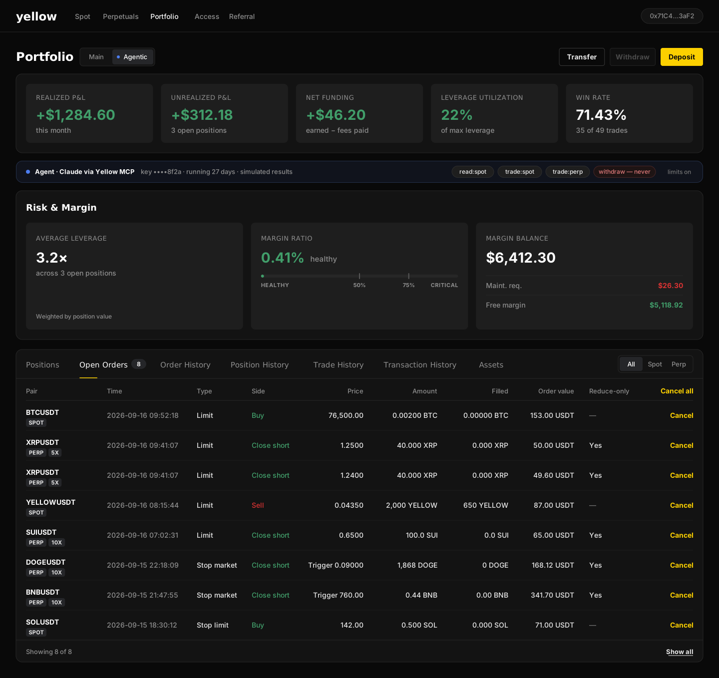
Yellow.pro had shipped a Portfolio page from zero earlier in the year, a nine-widget hub I had specced: equity curve, P&L, asset allocation, funding, liquidation distance, leverage and margin cards. Next to it in the navigation sat an older Assets page: balances per account, deposit, withdraw, transfer.
I managed the redesign end to end: framing the problem, directing the design through three prototype versions, locking decisions in a written ledger, and turning the result into an epic with two sub-epics for engineering. The hard constraint: this is a live trading product. The existing visual system, navigation and account model were not up for debate, so the novelty had to sit in a few core components.
02Problem
User pain. "What do I have?" was answered on one page and "how is it doing?" on another, with different numbers in different places. Yellow's account model made it worse: a Google sign-in user has a Yellow Wallet, a Spot account and a Perpetual account; an external-wallet user has two of those and a read-only wallet. New users regularly could not tell where their deposit had landed, or whether it had landed at all.
Business pain. The moment between "I sent a deposit" and "I placed a trade" is where a new exchange loses people. A deposit needs 15 confirmations; a withdrawal can take up to an hour. With no status anywhere on the page, that silence turned into support tickets and abandoned first sessions. And a brand-new user with zero balance landed on a page of empty charts.
03Approach
Style locked, attention where the novelty is. I ran this as a hybrid redesign: the page chrome, tokens and existing widgets were inherited and frozen on day one, and iteration went only into the genuinely new parts. Every behaviour was grounded in the public product docs rather than memory: the account model, the status vocabulary (Pending, Completed, Failed), confirmation counts, fee tiers.
Decisions as cards, not opinions. Each open question went to stakeholders as two options, a recommendation and the belief it bets on:
| Question | Options | Call |
|---|---|---|
| How do you pick a view? | The account cards are the switch, or a separate All / Spot / Perp control | Cards are the switch. One less control, and the balance is the label. |
| Where does deposit status live? | A banner above the cards, or a pill in the header | Banner, two rows max plus "+N more". It must be seen without being looked for. |
| One time range or many? | One selector for P&L, funding and metrics, or one per chart | One. Comparing charts on different ranges is how people misread performance. |
04Decision
- One page, four views. All accounts, Yellow Wallet, Spot, Perpetual. The account cards are the navigation.
- A status banner for money in flight, colour-coded by state: pending, pending over an hour, failed, completed. It tells the user what is normal ("15 confirmations") and when to contact support.
- Zero balance gets one button. Transfer, Withdraw and Deposit collapse into a single "Add funds" call to action, and the empty charts step aside.
- A Deposits & Withdrawals tab with search, status, network fee, received amount and transaction hash, so "where is my money" has an answer in the product.
- Performance people can compare: 1D, 1W, 1M, 1Y, all time, with risk-adjusted tiles (return, volatility, Sharpe, max drawdown) and good / bad colour on every KPI.
- Asset allocation with a per-asset view, splitting USDT by account and keeping zero-balance coins visible.
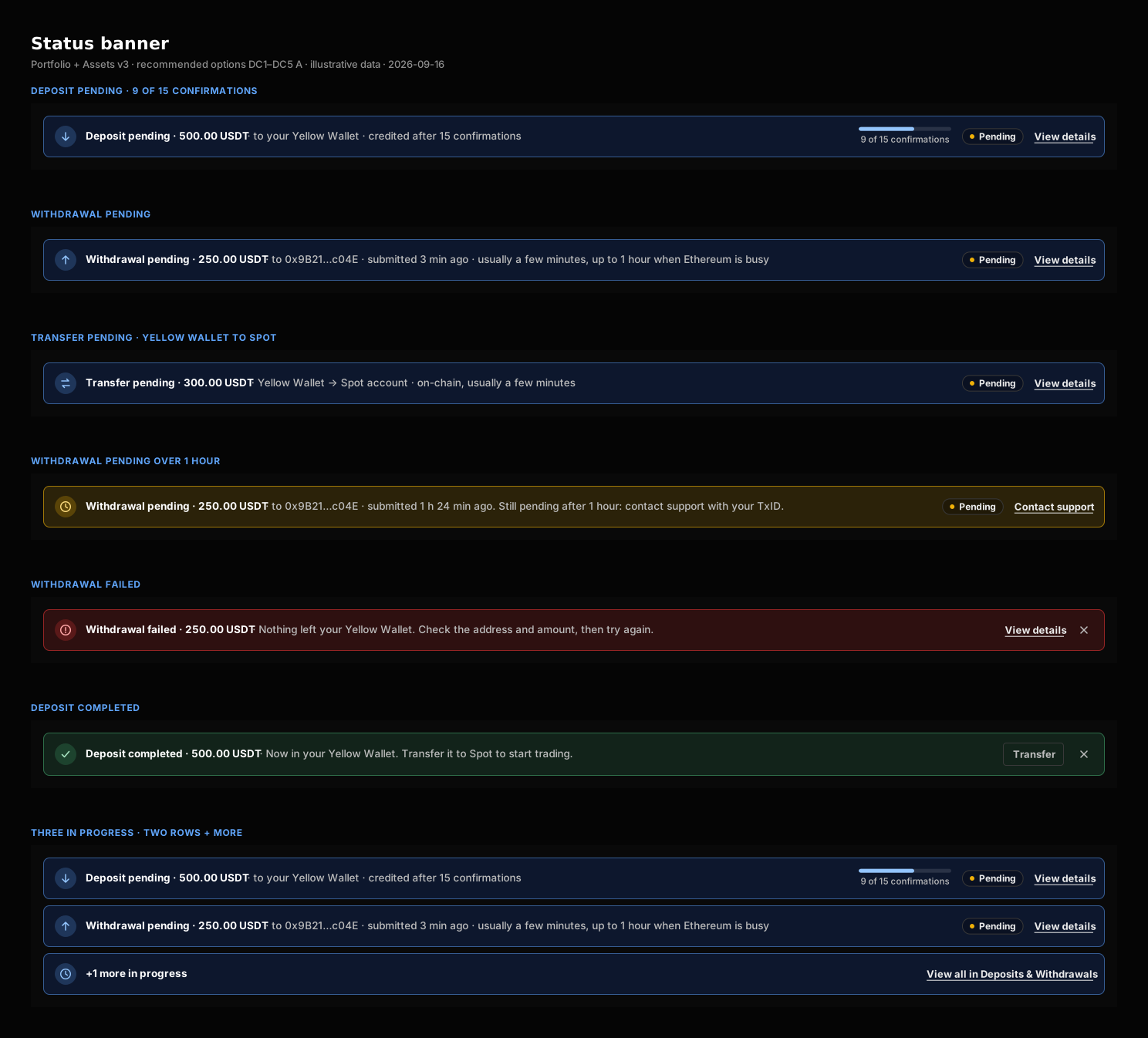
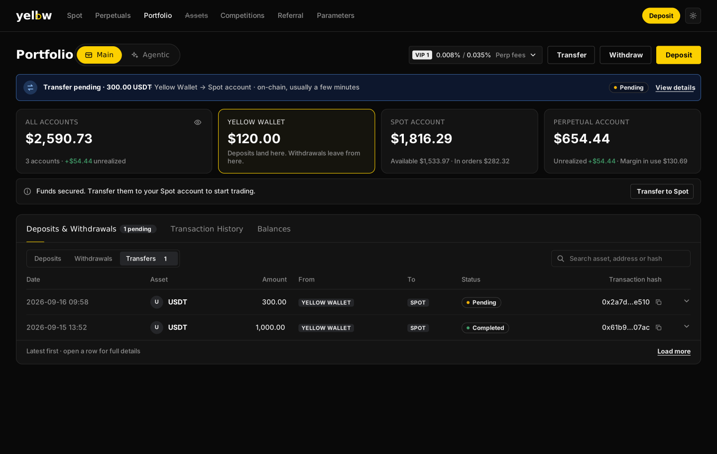
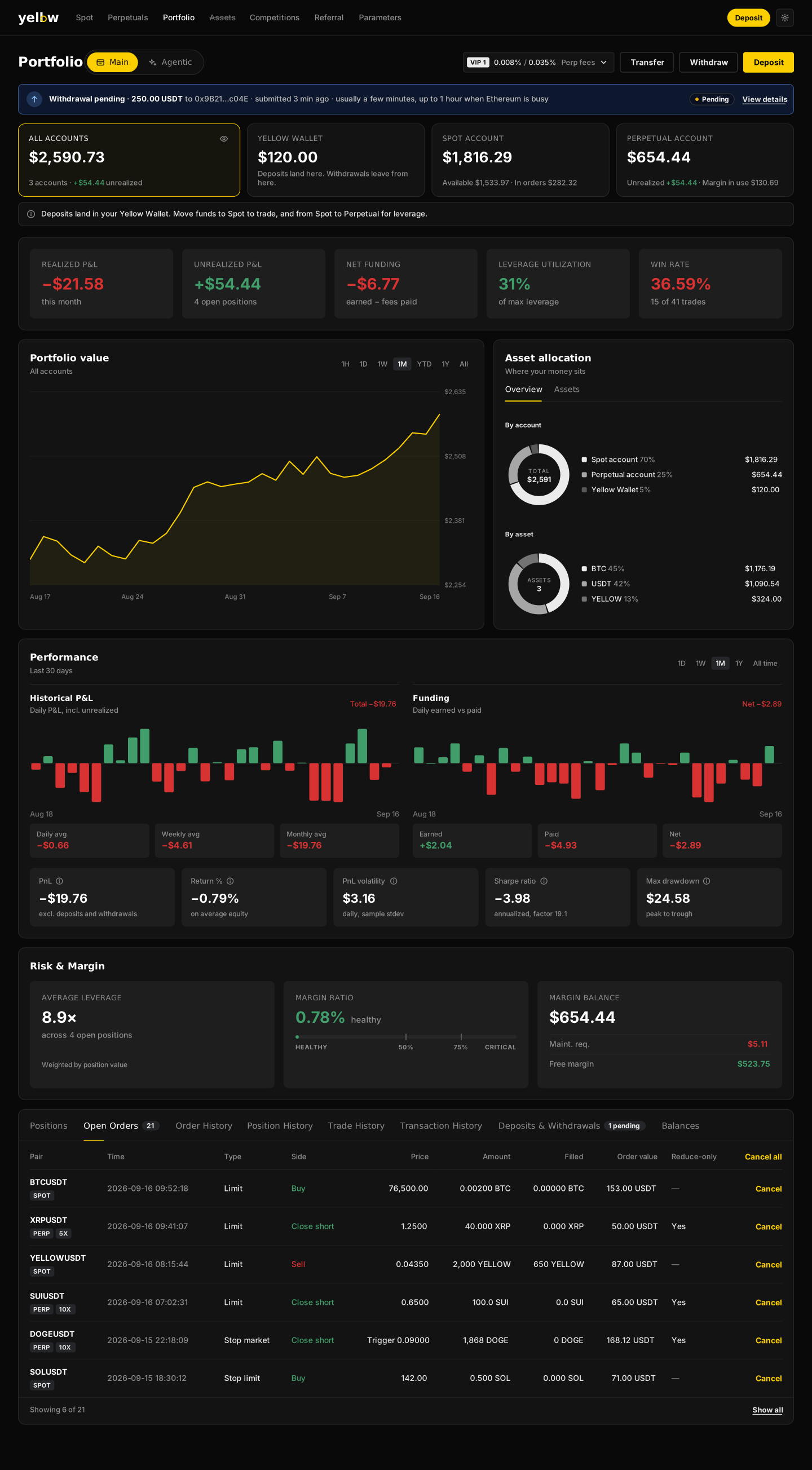
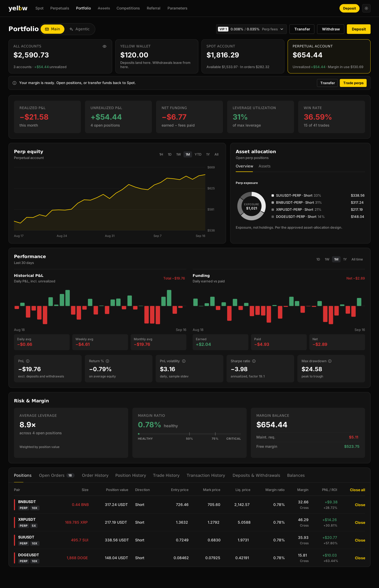
The handoff was a Figma-ready package: five page views and eight component boards covering fifty states, each mapped to acceptance criteria in the tickets.
05Outcome
Portfolio v1 is live and is the page I open first when I trade. The merge is specced and in estimation, so there is no before / after metric yet and I will not pretend otherwise. What I will measure: deposit-to-first-trade time, "where is my deposit" support tickets, and visits to the old Assets route after redirect.
What surprised me. Writing the spec found a definition bug before any code existed: the metrics engine defined volatility and drawdown as return ratios while the requirements, a past bug fix and the live page all used dollars. One written definition now exists. A redesign is often the first time anyone reads all the documents side by side.
06Reflection
I would settle the data questions before the pixels. The 1Y range looked trivial in the prototype; the metrics engine only served 24H, 1W, 1M and all time. And a Sharpe ratio computed from one day of hourly points is noise (it showed −18). Both surfaced late. Now I check what the backend can serve before a range selector gets drawn.
I would also decide mobile in the same breath. The merge removes the Assets page on web, while mobile still has an Assets tab in its bottom navigation. That is a product inconsistency I created and have not yet closed.