
A landing page where every claim is provable
Yellow had no public front door: the app geo-blocked visitors before they learned what it was. I managed the landing page from brief to build-ready spec, plus public Fees and Markets pages.
- Role
- Senior Product Manager: brief, copy rules, design direction, spec, tickets
- Scope
- Landing, Fees and Markets pages · desktop + mobile
- Status
- Approved as spec basis · in estimation with engineering
- Proves
- Growth sense, positioning, working with legal and marketing
01Context
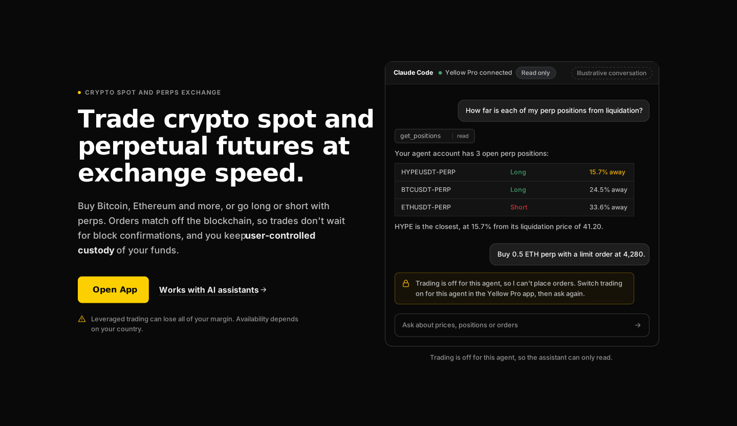
Yellow.pro's only public surface was the app itself. I owned conversion across signup, deposit and first trade, and the funnel started with a hole: there was nothing to land on. I managed the landing page as a product, not a brochure: brief, positioning, content rules, eleven prototype versions, a locked decision ledger, and an epic with desktop, mobile and geo-routing tickets.
The constraints were unusual. A regulated product where copy is a legal surface. A brand with two palettes that must never mix. And a page that visitors from restricted countries would be able to read.
02Problem
User pain. A visitor from an ad or a tweet arrived at a trading terminal, or at a geo-block page, with no explanation of what Yellow is or why it is different. Paid traffic was being sent to a login wall.
Business pain. No page to rank for search, nowhere to send campaigns, no way to measure top-of-funnel. And the two real differentiators (user-controlled custody at exchange speed, and AI-assistant trading) were explained only in the docs.
03Approach
Several independent structures, then a synthesis. I commissioned competing page structures, had them critiqued against each other, and took one rule from the result: one job per section. Setup instructions moved to the docs. The plain-language explainer of perpetual futures came back in.
Copy rules before copy.
- Speed is described by mechanism, never by a number: "orders match off the blockchain, no block confirmations". No latency claim to defend.
- Custody is always "user-controlled custody". One phrase, everywhere.
- No containment promise for AI agents. The page states the mechanism (a separate agent account) and says "fund only what you can afford to lose".
- The portfolio section shows only what the public docs document. An early version advertised risk alerts that did not exist. I cut them.
Geo as a routing decision, not a wall. Serve the landing page everywhere; enforce geography at the moment of app entry. Every "Open App" button hands off to the app's own check.
04Decision
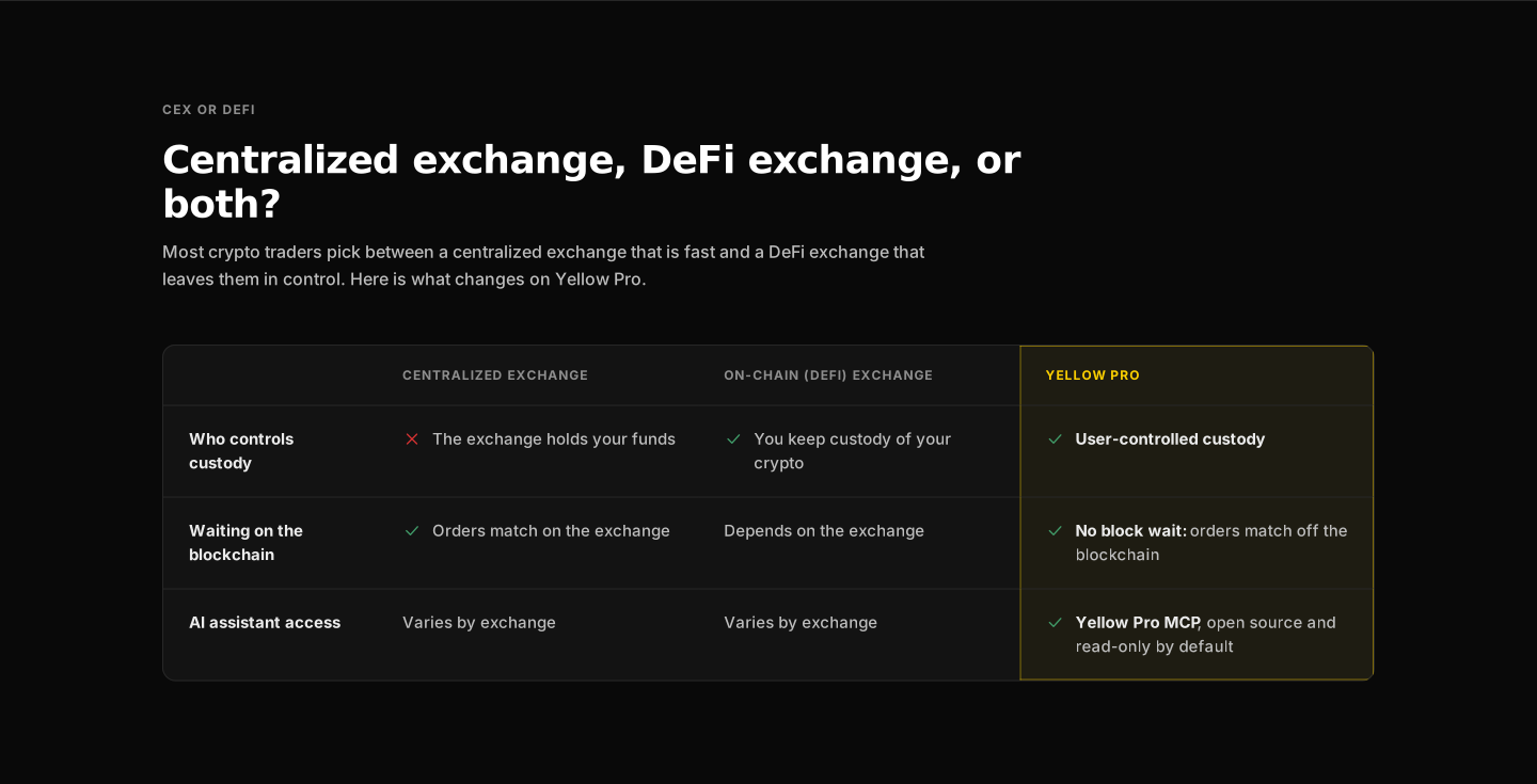
Section order, each with one job: hero → comparison → AI and MCP → portfolio tracker → spot and perps → fees compared → blog → FAQ → closing call to action.
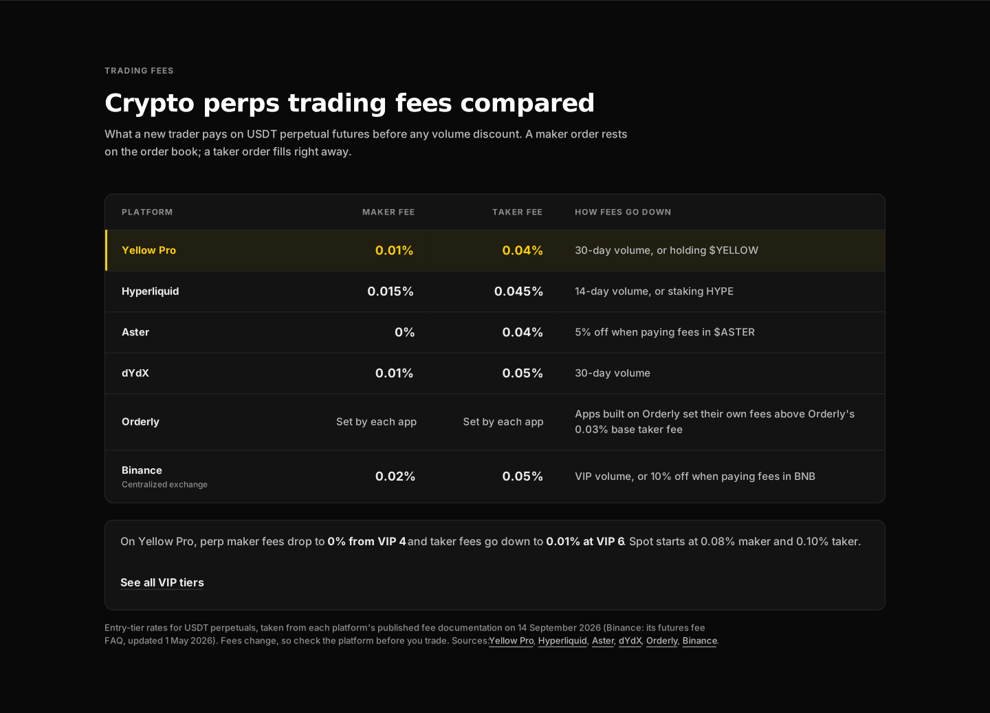
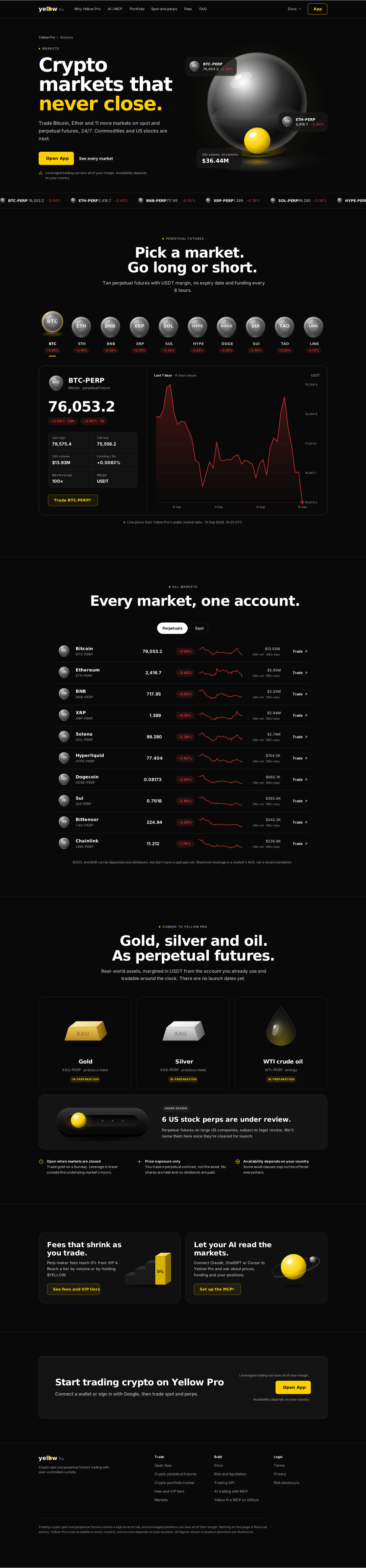
Two links became two pages. "See fees" and "Browse markets" originally pointed into the app, which meant into the geo block. I scoped public Fees and Markets pages fed by public API endpoints, so the numbers are live rather than pasted.

05Outcome
Approved as the basis for the spec, ticketed, and in estimation with engineering: an epic with desktop and mobile build tickets and a geo sub-epic. Not live yet, so no conversion number; claiming one would break the rule the page is built on.
The measurement plan is written into the spec: Open App click-through, clicks into the MCP docs, an organic-traffic baseline taken before launch, and rankings for the section-heading keywords.
What surprised me. The honest fee table was the easiest decision to make and the hardest to get agreement on. Showing a competitor beating us on one number is what makes the other five believable.
06Reflection
Eleven versions was too many, and the cause was mine. Twice I unlocked the visual style mid-project, once for a bolder direction and once to adopt a new design system, and each time the locked copy had to be re-verified against the new layout. Next time the visual direction is a decision made once, at the start, with the brand owner in the room.
Legal should see the first version, not the ninth. The open questions that remain (leverage figures and live prices on a page visible in restricted countries) are all legal questions, and all of them were askable on day one.
I let an automated feed onto a regulated page. The blog carousel pulls the latest posts automatically, and post titles can carry promotional claims I would never have allowed in the page copy. It needs a hide list that marketing controls. I caught it in review, not in design.